Ariel Tonglet
Hi!EN
PT
EN
PTI am a developer and infographic designer specialized in data visualization and interactive content.
I graduated in Arts at Unesp and, before focusing on programming, I also worked with graphic design and journalism. Therefore, I'm at my best when I can move between these areas, working on the possibilities of each project in these various stages.
When programming, I normally work with JAM Stack, using tools such as React, Next.js, Payload CMS, GraphQL and D3.js. Additionally, I have experience with Figma, Adobe Suite, QGIS, Node, Wordpress and CLIs like ffmpeg. Regardless, each project has a unique set of needs and I face the beginning of each process as an opportunity to develop new skills.
Over more than a decade, my work has been included in several design and graphic journalism awards such as Malofiej, SND, ñh, Brazilian Biennial of Graphic Design and Brasil Design Awards.
Currently
Fullstack developer @ Polar, Ltda.
Designer and fullstack developer @ Museu dos Aflitos
Before
Senior front-end developer @ Kunumi
Web designer @ O Estado de São Paulo
Developer @ Nexo Jornal
Infographic designer @ Folha de S.Paulo
2023Site
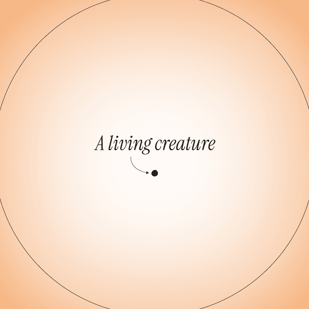
Macromicroscope
Final project of the master's thesis “Visualizing the Unimaginable: hyperobjects and data visualization in the Anthropocene”, by Rodolfo Almeida, Macromicroscope is a video installation. The artwork aims to make explicit the relationship between climate change and the populations of certain animal species over decades.
In this project, I collaborated on two specific points: Firstly, I developed a jsx script that was used to automate the creation of elements in After Effects based on population data. This material was used as a teaser for the project and can be seen on youtube. After that, I contributed with a simple website that could receive the final product, developed in Cables.gl, with an introduction and supporting texts.
—
Featured in: Information+ Conference 2023
2018Map
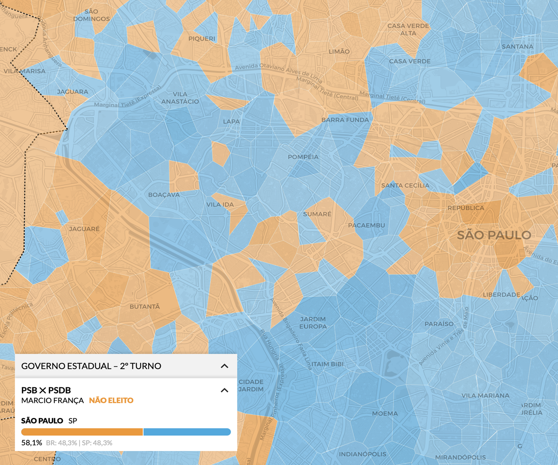
How did your neighborhood vote?
In an unprecedented mapping, Estadão's data and art desks created a detailed geogrid to display the results of the 2018 elections. Unlike conventional maps, which displayed information by city, we were able to subdivide each city to allow the visualization of results by neighborhoods.
My role in this project was to create the tool that unified voting data and neighborhood census data with the detailed grids of each city. The tool allows you not only to view in detail the results of elections for president, state governments, senate and chamber, but also to check the socioeconomic profiles of each neighborhood.
I worked on both layout and development of the tool, which was based on the Leaflet library. A more detailed explanation of the project can be seen here (in portuguese).
—
Awards: Bronze at SND - The Best of Digital Design • Bronze at ñh 2019
2023Site
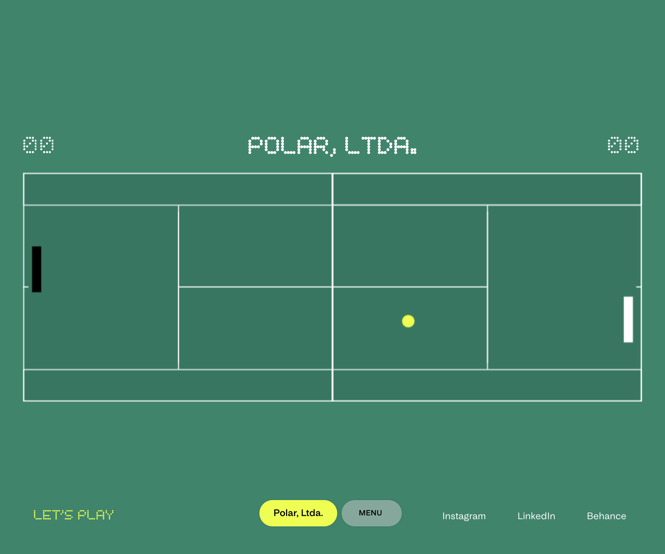
Portfolio — Polar, Ltda.
Built with Next.js and Payload CMS, Polar's portfolio is a website full of details. Each page has an unique layout and many components behave differently depending on the screen size or its content. Additionally, it is a project that covers many possibilities of formats: photography, illustration, galleries (more than one type), video embed, table, card, modal, contact form, and even a custom pong game — all available in two languages. One of the most complete and detailed projects I have ever worked on, in which I was able to develop all stages, from back to front-end.
—
Featured in: Design Everywhere • UX/UI Behance Highlights
In collaboration with Polar, Ltda.
2020Dataviz
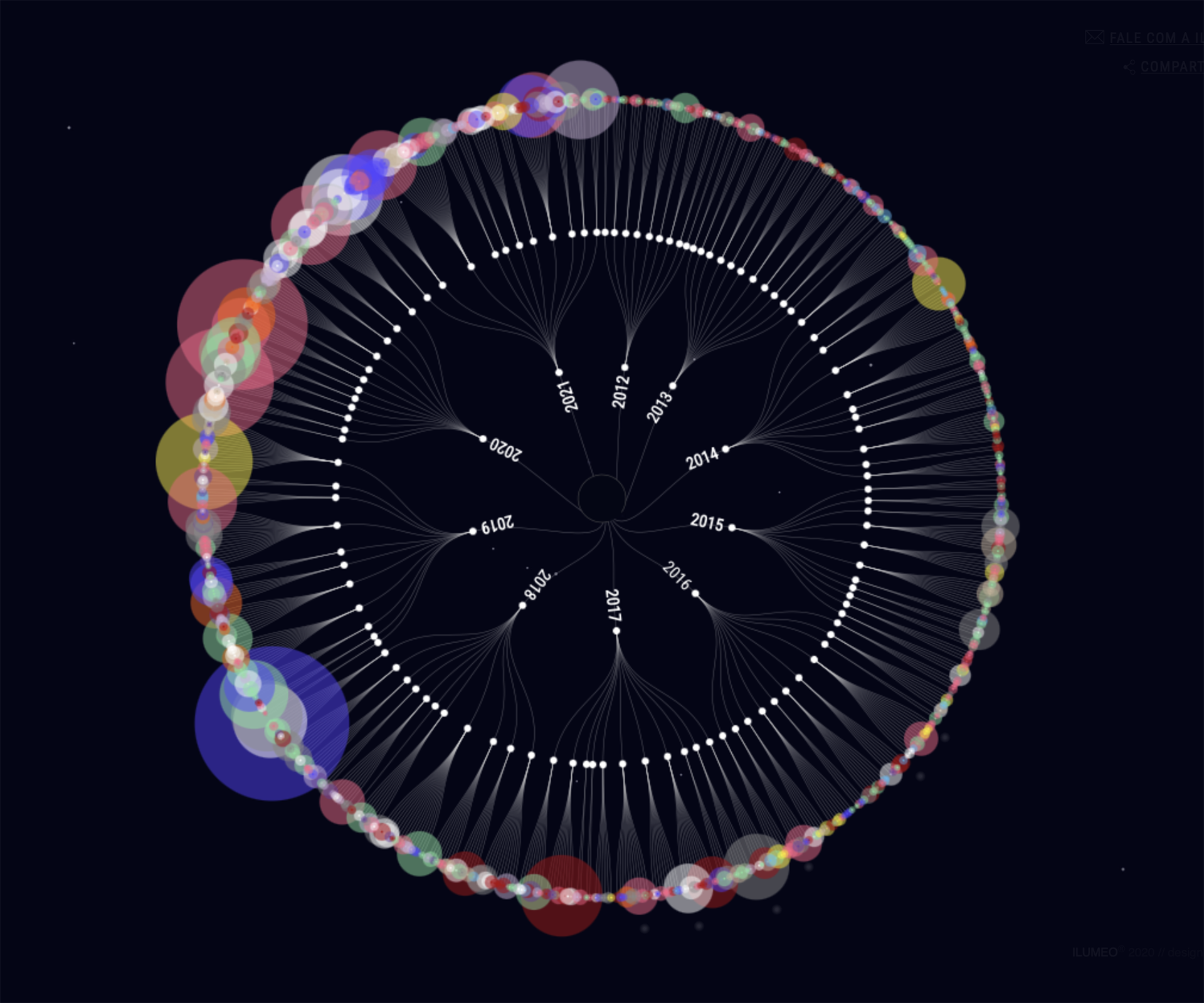
Projects — Ilumeo
Data visualization made with d3.js, for Ilumeo, which compiles all its projects into a large dashboard. The user is invited to filter the data and navigate through some selected highlights.
In this project, I worked with the Datadot team from the beginning, helping to think about the best way to display the information and navigation tools in the layout.
—
Awards: Silver at the 2020 Brazil Design Award • Selected for the Brazilian Show of Information Design 2021 • Shortlist Information is Beautiful 2022 • Honorable Mention at the Ibero-American Biennial of Design 2022
In collaboration with Datadot estudio
2021Infographics
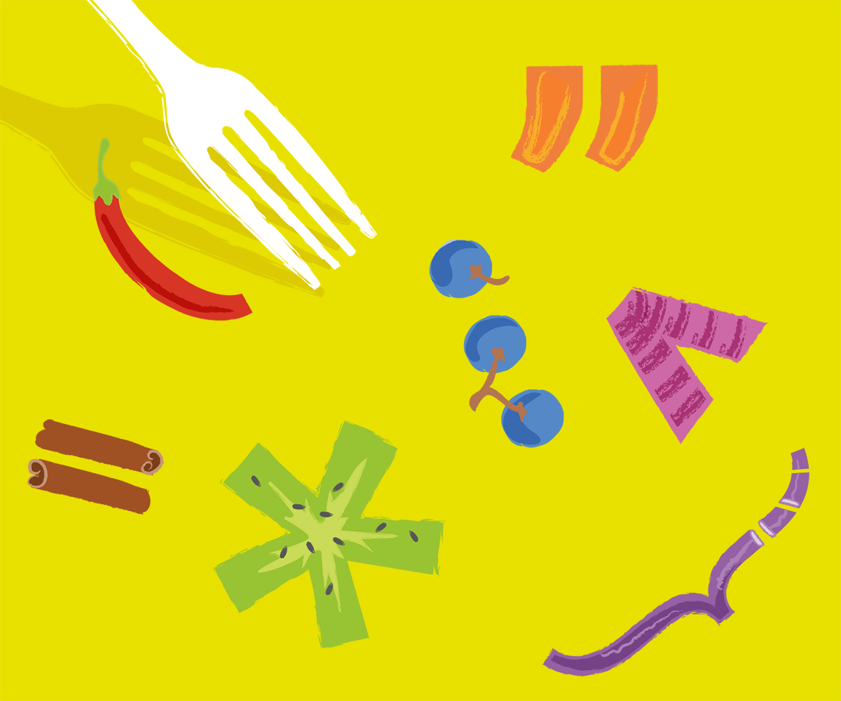
Food on the Agenda
Publication produced for Idec — Brazilian Institute for Consumer Protection. As a member of Desdobra Coletivo, we produced this printed and online material to guide journalistic coverage when addressing food in reports.
The Guide features discussions on topics such as healthy eating, nutritional and epidemiological transition, obesity, chronic non-communicable diseases linked to food, breastfeeding, agriculture, pesticides, genetically modified organisms, agroecology and the food industry – always from a collective perspective and avoiding individual blame. There are also support sections with coverage tips, case analyzes and indications of sources and tools.
In the initial stages, I helped organize which contents would be covered and define important points for the use of visual resources such as infographics or tables. I also collaborated in the design of the graphic project and content layout, and was responsible for producing the infographics, adapting the layouts for the online guide, and developing it.
In collaboration with: Desdobra Coletivo and Idec
2021Site
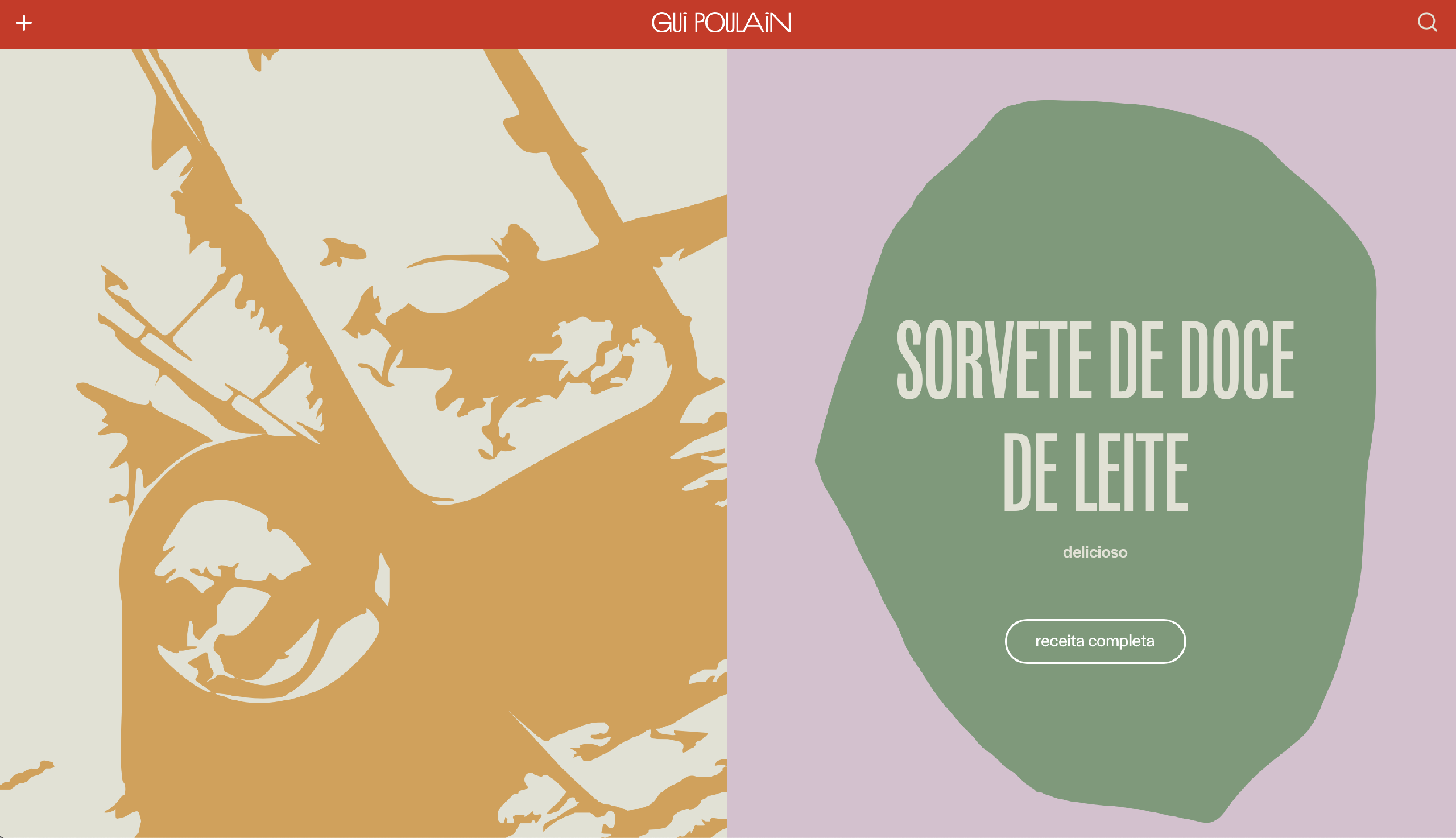
Gui Poulain
A recipe website for Gui Poulain, built with Wordpress headless and Gatsby. We added some details to the recipes’ pages to make them highly functional. There is the possibility to adjust the measurements (between cups and ml, for example) and also the servings. In addition to that, the mobile version focuses on the preparation, with a button to access the recipe's step-by-step in full screen. I really like the solution we came up with for the images’ placeholder, in SVG, which fits very well with the visual identity of the project.
—
In collaboration with Polar, Ltda. e Bruno Berkenbrock
2021Dataviz
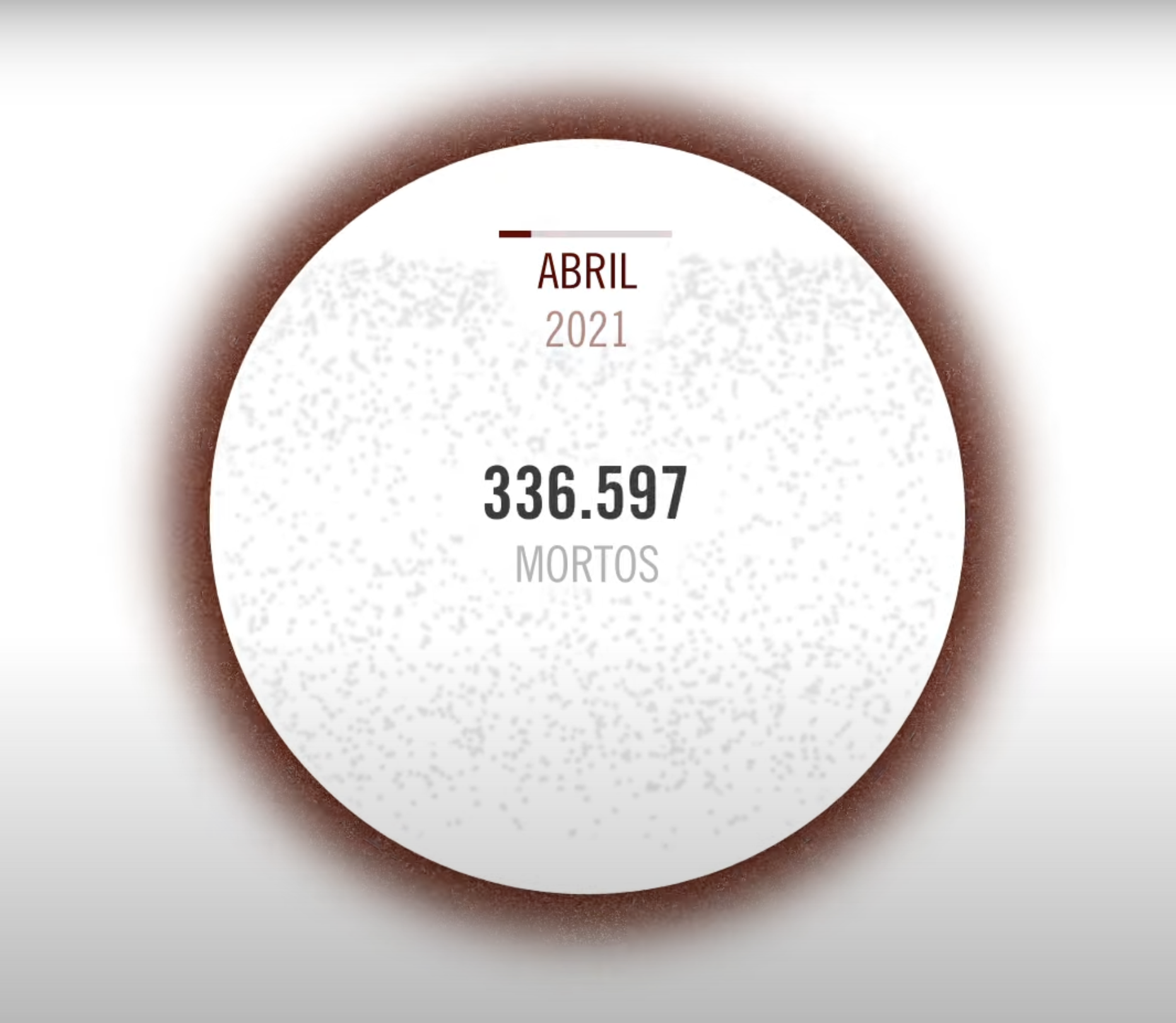
A country out of breath
Animated data visualization and sonification produced with Rodolfo Almeida for Revista Piauí, that shows Brazil's landmark of 500,000 deaths due to the Covid-19 pandemic. The archive version of this content contains the static part of the project, which takes into account the deaths since the beginning of the pandemic until the launch day.
During the active phase of the project, at the end of the video, we also inserted dynamic data based on updated information: the same circular element from the video pulsed according to the frequency of deaths from the previous day (e.g., Yesterday, one Brazilian died from Covid-19 every 30 seconds).
This content was displayed on the website's homepage, but also in a reduced version, as a fixed header that accompanied the user while reading the articles.
—
Featured in: Outlier Conference 2023 • 18th Abraji International Congress of Investigative Journalism
In collaboration with Revista Piauí and Rodolfo Almeida
2020Multimedia feature
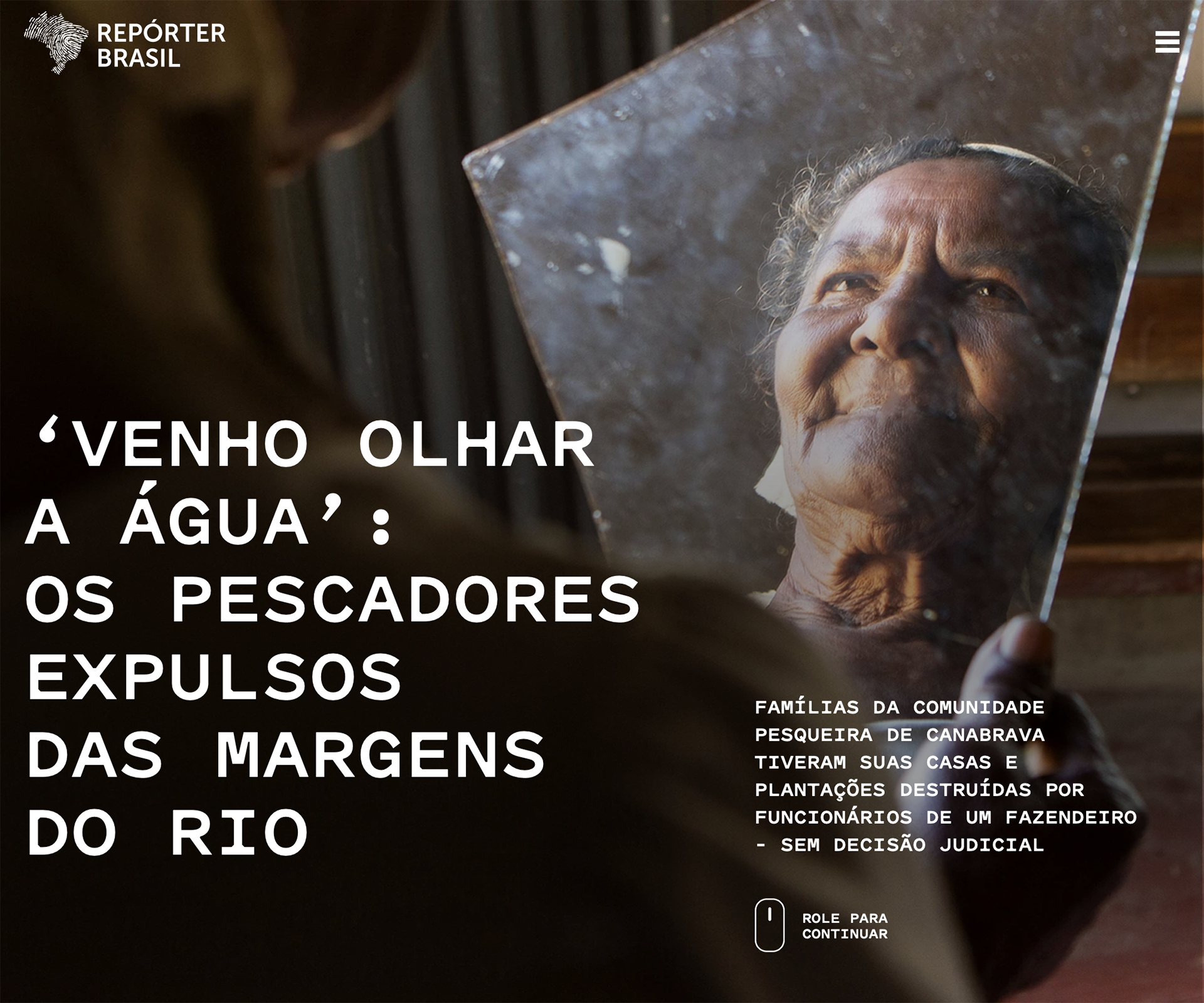
Velho Chico
Special feature from Repórter Brasil exposes, in different media, the violence suffered by peasants in land disputes on the banks of the São Francisco River.
The front-end of this project was developed in Gatsby, to generate a static website. For content editing, we used a simple CMS in Strapi.
In addition to the interactive content for galleries and scrollytelling, I particularly like the solution for the drop caps at the beginning of each page: the site code converts the first letter into an SVG, so that the precise fit of the layout is maintained, while keeping text accessible to screen readers.
—
Awards: Silver in Brazil Design Awards 2022 • 42nd Vladimir Herzog Journalistic Award for Amnesty and Human Rights
In collaboration with Datadot estudio
2019Site
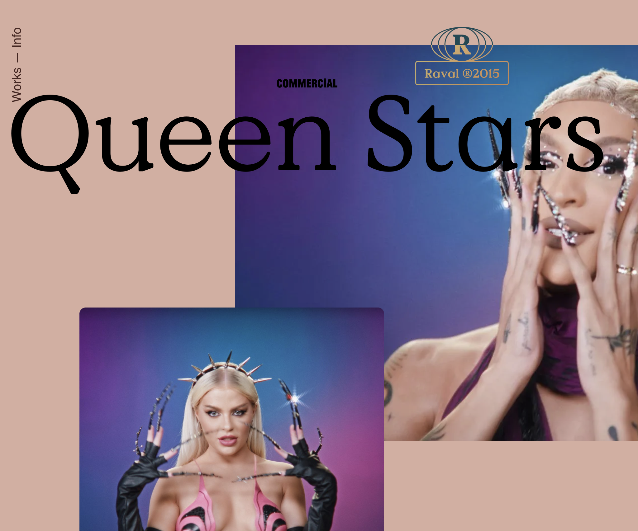
Portfolio — Raval.cc
Website for the film production company Raval.cc, made with Wordpress. The main objective was to allow home highlights and internal page content to be assembled in different ways.
Projects can be simple, with just a video and technical sheet, or a complete page with texts, images, videos and galleries with different customizing options for colors, sizes and positioning.
We also inserted some interaction details to enrich the user experience both in the logo, fixed at the top of all pages, and in sections on the home page that appear among the highlighted projects.
—
In partnership with Polar, Ltda.
2018Dataviz
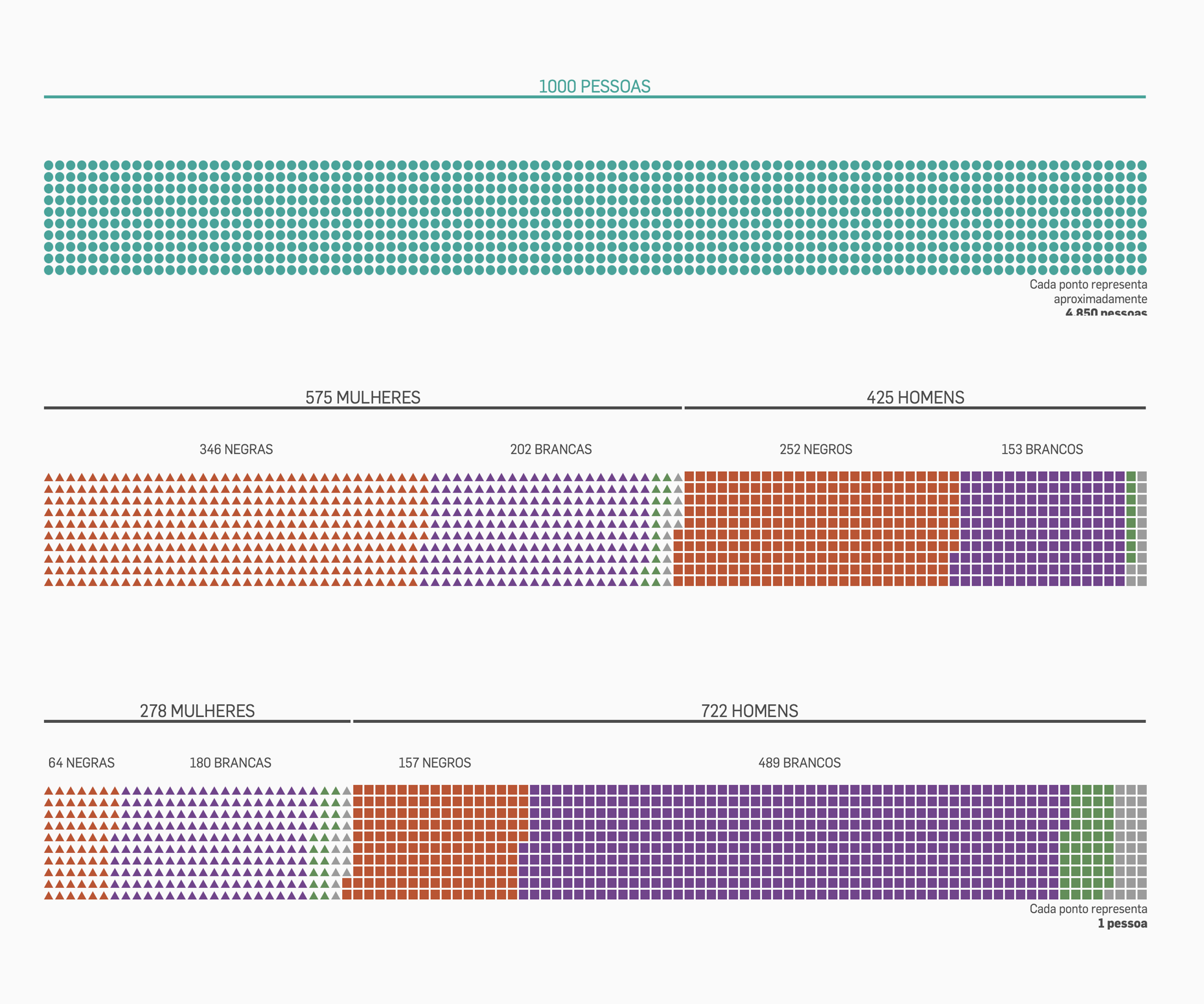
Men have 72% of top thousand Enem grades
Multimedia feature that profiles students from Enem — National High School Exam —, especially those with the best grades. The final result, in the online version, was a scrollytelling data visualization that guides the reader. It compares, base on gender and race, the total universe of students who took the test versus those in the top 1,000. Other infographics also analyze the issue from socioeconomic, geographic, parenting and more points of view.
I worked on this project from the very first stages. Based on the initial idea, I set up a crawler in Node to obtain student data from Inep — National Institute of Educational Studies and Research. With this data in hand, I analyzed together with the journalists which data would be interesting to highlight. Then, based on these insights, I developed the special page with infographics and the content of the report.
2018Site
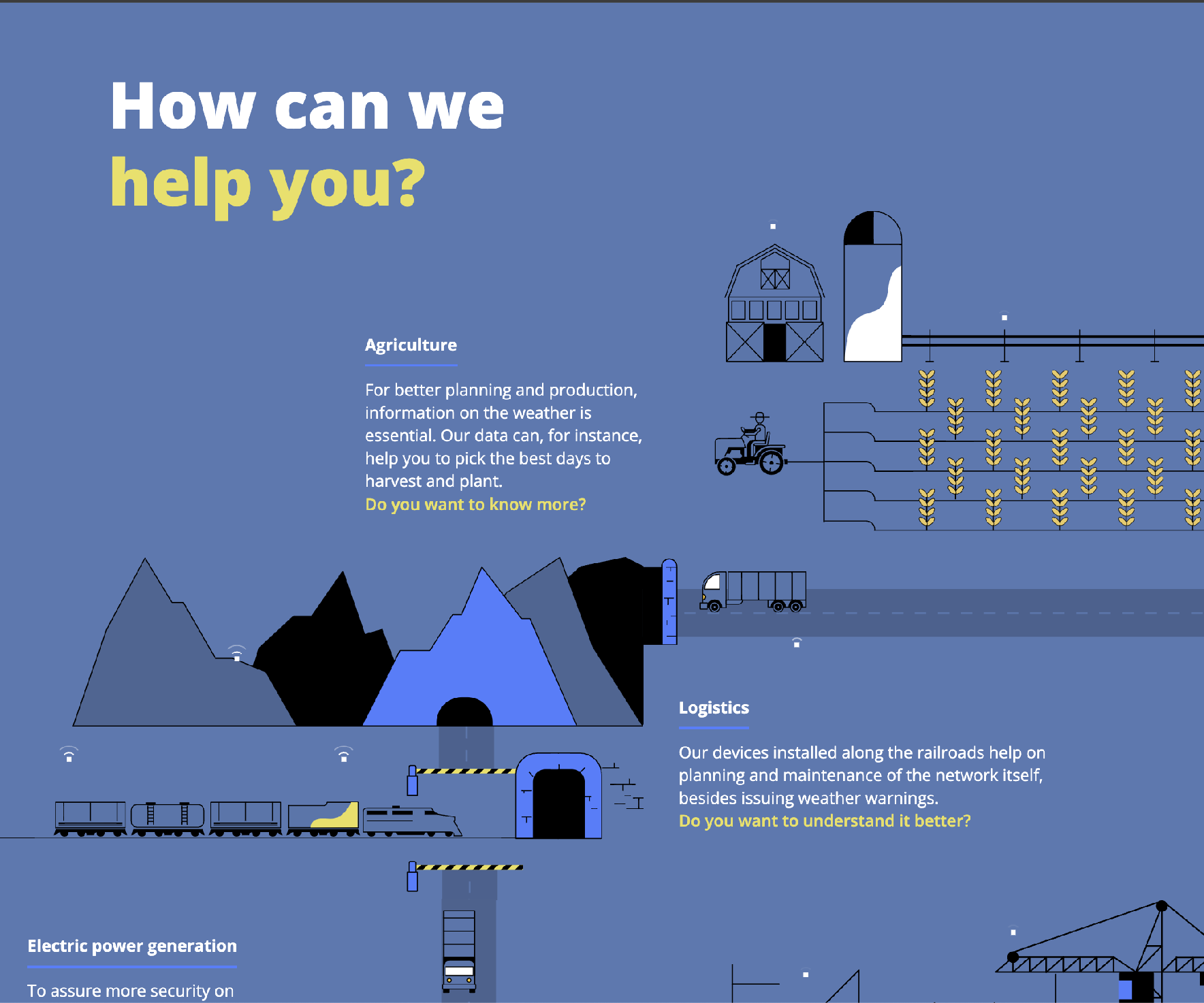
Pluvi.On
Institutional website for Pluvion, a weather monitoring startup. The company wanted a simple static HTML site, that they could edit directly in code. To enrich the content without increasing technical complexity, we used Lottie library to add animated SVGs to support textual content in the interface.
—
Awards: HOW Awards 2017 • Shortlist Brazilian Biennial of Graphic Design
In collaboration with Datadot estudio